Saturday, June 30, 2012

A Diogaurdi Discovery


Diogaurdi, a well known luxury fashion house that hit Stardoll in 2010, is making it's comeback this Summer, headed by the fabulous Chris Grau and Manolo. Every fashion brand needs a face, right? What better than to host an amazing Summer competition in which YOU could become the face. Chris will be explaining the actual competition, and remember to apply in the comments.

So now I’ll give you all the information you need to participate in this fabulous competition, directly sent by Chris, Dioguardi’s co-owner. There will be 3 tasks which you’ll have to pass If you want to become Diogaurdi’s next face.

  • First Task. Starting with a maximum of 25 contestants, depending on the number of people who decide to join the race.
- In this task you have to create an impressive make up and outfit, at your Suite or If you like better at Starplaza, and preferably a Haute Couture one.

  • Second Task. There will be 10 competitors, the ones chosen from Task 1.
 - In this task you have to create a Fashion Show in one of your sceneries. Try to be as original as possible, creating an unique and glamurous runway and stylize your MeDoll exclusively!

  • Final Task. There will be 3 contestants, the finalists chosen between the Second Task competitors.
  - In this task you have to create a Fashion Editorial occupying two pages in your Album. Try to look for a comercial result, we want to see what’s your idea of a Fashion Campaign. Of course, make visible that the editorial is for Dioguardi.

*IMPORTANT: You’ll have 1 week to make your entry in each task, starting this Monday, 2nd of July. To submit your entries, there will be a created page here in TTT for each task. Don’t worry, you’ll be informed and you’ll see the entries pages clearly.

All the tasks, as well as the final result, will be judged by Kimberly, owner of TTT, Manolo and I. The winner won’t only get to be Dioguardi’s next season face, starring all the campaigns, ads and invites for the Brand, but also will get a money prize of 150 Stardollars! So, what are you waiting for?

Do you want to be Dioguardi’s Next Top Face? Comment on this post with the following information:

  • Stardoll Username:
  • Real Name:
We want you to participate, so don’t miss this opportunity! The contestants will be announced in the next 2 days, on Monday. Thanks for your attention, and thanks Kimberly for letting this competition to take place in the wonderful TTT!
              

Wednesday, June 27, 2012

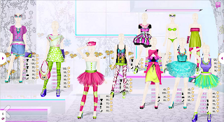
July Hotbuys: Rainbow Deluxe


Stardoll have certainly stuck with the theme of bright colours with this months Hotbuys, with neon lime and pink prints everywhere. Although I'm not usually fond of the generic turquoise, pastel pink and purple combination that Stardoll seems to adore embedding in Hotbuys, I do like this month's picks. I get sick of the bright colours in months where they should be far more neutral...
For example I haven't really loved any of this year's hotbuys because Stardoll uses the same colours over and over again and for months like January, I'd much prefer navys, browns and blacks. Back to this months selection however... Starting off with the medoll.I would hate this any other month, but I find it so cute for the month of July. The pink hair and cheeky wink and smile are fun, and the green eye liner and bubblegum pink lipstick really make it pop.


Hotbuys Heart Dress - It Girls - Released 19th July;
The Heart Dress is one of those perfect Summer must have dresses. I adore the simplicity of the bottom of the dress with the heart shaped detailing in the top. The green belt is a very nice addition to this specific item because I feel as though it would have been boring without..What's up with the pretty much non existant shading on the top though? It just looks like a slight fade... 8/10.

Hotbuys Sunglasses - Spectacular - Released 9th July;
These are a nice simple black pair of glasses with a gorgeous pink embellishment on the side and that's all I have to say to be perfectly honest. Love them... 10/10.


Hotbuys Zebra Top - Rio - Released 6th July;
I adore this! It's bang on trend. I love the shape of this blouse type top in general, the print on it is so chic and I love the pink collar. I hate to say this because I don't like how the Cross is used as a fashion symbol now, but it does look mega stylish. This is a definite buy... 10/10.

Hotbuys Stilettos - Rio - Released 23rd July;
We've seen these  type of shoes so many times before, but I guess it's an improvement from them ugly big block shoes we've seen released recently. I'd prefer some neutral shoes, but for July I guess these are quite nice though I probably won't purchase... 7/10.


Hotbuys 70s Dress - Bonjour Bizou - Released 12th July;
I'm on the fence with this one. I really like the shape, the print and the colours but it really all depends on how it looks on my medoll. We don't usually see many dresses that look like this, so it's nice for a switch up once in a while, right? 7.5/10.


Hotbuys Square Necklace - Glam'rus - Released 14th July;
I guess it's a nice necklace. Jewellery doesn't always really jump out to me in Hotbuys. Stardoll seem to be releasing a lot of block type necklaces though. Once again I'm unsure. We'll see when it is released. 7/10.


Hotbuys Multi Bangles - Original Future - Released 29th July;
Multi coloured bangles, that's all there is too it really. They sort of look like an assortment of different coloured rubber bands. Nothing special... 6/10.

Hotbuys Splash Bag - Original Future - Released 2nd July;
I don't really like this, it's pretty tacky to be honest. I like the shape, but I would have prefered if the bag was black with golden studs or something. Once again, definitely not a stand out... 6/10.

Hotbuys Floral Shorts - Evil Panda - Released 16th July;
Okay, so they are called Floral shorts, but is it just me or do they look they have dart boards printed on them? It definitely doesn't look like florals to me. 5/10 for these dart shorts sadly.

Hotbuys Gradient Jacket - Pretty 'n Love - Released 26th July;
A GRADIENT BLAZER, OH MY! I absolutely adore blazers and all things chic style, and gradient is one of my favourite trends of the moment, so this really is my perfect combination. I just hope it fits well.. 10/10.


And that's this months Hotbuys for you! I quite like alot of them actually, although a few are quite weak. I will actually be away from the 5th until the 12th, so I won't be able to post when Hotbuys come out or if LE is released. Sorry for not posting LE Showdown Part 2, I'll get to that tommorow hopefully.

Sunday, June 24, 2012

LE Showdown

PART 1! - 13TH PLACE TO 8TH PLACE!
Instead of doing a regular through the seasons on Limited Edition, I thought I'd spruce things up a bit and do a best to worst showdown type post. Remember to comment!


WORST EDITION; Season 12
Click here to view full collection!


The 12th collection start us off, being named the worst ever LE collection. The pieces were costume like and the random pieces of furniture failed to impress. Many of the designs were lacklustre and looked as though they were pulled from a reject Stardoll store. The high points of this collection in my opinion are the amazing interiors (although I don't like it when the LE backdrop doesn't look like a shop) and the jackets. Mostly every item looked like a tacky halloween costume and though the quality was poor, it was still a pricey (And not that limited...) collection.


12th PLACE; Season 10

This 'Electro Lux' collection did not seem to impress many Stardollians either. The wonderful store backdrop was let down by the colourful and neon designs.

Not many items in this collection truly looked LE looking and alot of them weren't up to the quality standard LE usually fulfils.
The fishnet dress and bikinis were definite let downs in the collection, with quite a bit of the edition looking like some sort of Monster High reject outfits.

There was however a few pieces that I did like such as the leather jacket, which was the store standout in my opinion. What do you think of this electro collection?


11th PLACE:  Season 13


I've had, you could say, a love/hate relationship with this collection. When it first came out I though it was amazing, although like the 10th quite tacky, I still liked it. When it came round to the actual release I bought around 2000 stardollars worth of stuff. Now however, in retrospect I do heavily regret this. I think many items are pretty vile and the two-part items really weren't the best. The colour scheme was quite awful, however there is roughly about 10 items I do actually like. I must say though, I can't wait to get this semi-mess out the starplaza and swapped for a (hopefully ) stunning new collection.


10th PLACE: Season 9

This is a marmite type of collection in my opinion. The colour scheme was off putting to many avid LE buyers, though to others it totally made the collection. I know that many dislike the whole lip print trend and find it quite childish and I have to agree. Most items that had the lip print swatched over them were a pretty ugly bunch. However there was a few stunning items from this collection, like the dresses (and there was quite alot of them at that..) a few of the tops and the shoes. I am quite fond of this collection, and though the marking may seem quite harsh, compared to others it is quite weak.


9th PLACE: Season 8


This collection was very casual and was full of shorts, over knee socks and tees. Tartan prints took over and plaid was everywhere. This specific edition featured alot less dresses than previous collections had, but the ones it had were very chic yet laid back. The store had somewhat of a plaid forest theme which looked absolutely amazing. The only reason why this collection is as low as 9th is because I personally prefer the more glamorous LE collections with the show stopping dresses and studs and what not.


8th PLACE: Season 6


This was a very simplistic and cute spring collection with a few totally luscious items in there, but over all the shop was quite bland and there wasn't that much to offer. It was a very ready to wear collection and most items were made very well in the gaphics department. You can recognise a few rare items from this, such as the Paperbag skirt, Chanel coat and Faux leather bag. I for one really like this collection, but I know for a fact many other rate it as very mediocre.


What do you think?
Tune into part two tommorow!
Remember to comment -x-

Friday, June 22, 2012

LE PROJECT!

New posts coming soon; Antidote Review, July Hotbuys & Through The Seasons

LE PROJECT will be coming soon:


Remember to comment!

Thursday, June 21, 2012

Konichiwa High Fashion!


Konichiwa! Today I will be bringing you the fashion fix from the gorgeous Tokyo Fashion Week.
It premiered not long ago, so this might be kinda late.

My first favourite is..

Masaya Kushino

He is an extremely talented designer who express his art through shoes!
here are some of his amazing creations;


Oh my goodness! Just wow, I would DEFINITELY wear this shoes both on Stardoll and in real life.


Moving onto the next talented designer...

Plumpynuts

Besides the funny name, Miyuki Omichi and Ayumi Kita worked together to create a 1950s style mixed with 1980s pop.
Here are some of the designs;

Plumpynuts F/W  2012-13.  Photo via Plumpynuts.Plumpynuts F/W  2012-13.  Photo via Plumpynuts.Plumpynuts F/W  2012-13.  Photo via Plumpynuts.Plumpynuts F/W  2012-13.  Photo via Plumpynuts.Plumpynuts F/W  2012-13.  Photo via Plumpynuts.Plumpynuts F/W  2012-13.  Photo via Plumpynuts.

Amazing right? Japan has some incredibly talented designers!
I'd love to see these on Stardoll!

What do you think?


This post is also seen at 

Wednesday, June 20, 2012

Forever Chic Magazine Comeback Release


Forever Chic Magazine was once known as one of the best user-created Stardoll magazines out there!
Forever Chic MagazineWhen owner and founder, Nicole, "left" the Stardoll scene, the magazine fell and it was no longer producing issues.


Well, when the whole Chloe is Nicole thing arose, so did Forever chic. Nicole put production back in process and this most recent issue featured the owner of Today's Top Trends and Stardoll's Next Top Graphic designer, Kimberly.

The most recent issue features an array of graphics from Lindsey and Maria, Lilyqi, and Nicole.

The cover was the lesser appealing of all the graphics in the magazine.
 It seems boring and very bland with minimal text on the cover and a unflattering body shape. 
The hair is possibly my favorite part of the cover.

(Click the Cover to visit Forever Chic Magazine!)

Even though the cover wasn't very good, the rest of the graphics were STUNNING!

The interview with Kim featured her photo shoot which was created by Lindsey and starred very good graphics and fashionable outfits. 
I really love how Lindsey made this graphic. 
Up close, you can see the detail in her finger nails and the hair is very wild, but controlled.
This has to be my favorite graphic out of the whole magazine. It's very relaxed and relays peace, 
but also has that spunk and attitude graphic designers try to portray.
The magazine also features advertisements, which hasn't been seen since 
Recherche Magazine's first few issues.

Victory and Klaus newly created fragrance line
More portions of this issue:

So tell me what you think of this comeback issue of Forever Chic Magazine. 
Was it worth the long wait?

Introducing... Top Commenters


With user participation on this blog dim, to put it lightly, I felt as though it was time to try and make this blog more active. Hense I have decided to introduce top commentators! Basically, the top commenter of every week will win 50 stardollars for the next eight weeks or so. Who knows, I might continue it on after the Summer period.

I dislike bribery and all things similar, though we really need to get participation on this blog UP so it can be a funner experience for everyone. Even if it's a simple comment, every single one counts!

This will be the course of top commentators competition, so to say, it may continue on past these dates:WEEK 1 - 21st of June until the 28th of June
WEEK 2 - 28th of June until the 5th of July
WEEK 3 - 12th of July until the 19th of July
and so forth...


Once I get this widget up and running we will begin.

Tuesday, June 19, 2012

A Tribute Roundup

Stardoll are getting back into the swing of releasing their numerous yearly tribute stores once again. Chanel started off this years chain of collections, followed closely by Anna Sui and  more recently Nicholas Kirkwood, the shoes designer that I doubt many have geniunely heard of.

Chanel took the plunge this year, being the first tribute of 2012 to be released.


The collection seemed to impress most Stardoll users. Although the store actually lacked in some Chanel looking pieces, that the first season boasted, it was a very sweet and desirable collection. None of Chanel's luxury bags anyway? A slight dissapoint so to say, but the stunning jackets, dresses and the Coco purse.

The next collection to be released was Anna Sui. Many told their excitement for the arrival of this tribute, and from some of the gorgeous real life designs, I wasn't surprised. Though when the collection came, everyone couldn't help but to be slightly dissapointed. The tacky re-coloured barn looking designs looked as though they were made by graphic designers whom fell half alseep. Personally, I liked about five items out of the whole collection, which isn't good.

YUCK! What is with that ad anyway? Stardoll clearly have forgotten how to properly shade dolls... And what's up with that far left medoll? Er.. whatever you think looks good Stardoll, whatever you think looks good.

Moving swiftly on, Nicholas Kirkwood was released earlier today, many thinking the shop would have been just shoes. The shoes were utterly gorgeous to say the least... When the shoes popped up in spoilers, many thought a new collection of Limited  Edition was on it's way. Just look at that ad though, so beautiful! Very well designed... simple but effective. As you can see just from this ad, the shoes look amazing, and this poster of the tribute really makes me think back to the good old Stardoll days, when Stardoll put effort into everything they done. I for one know love Nicholas Kirkwood's shoes!


The clothes however, less on point with fashion but still graphically designed to pretty well. Clearly tons more effort than Anna Sui, to put it simply. I however loved pretty much everything in the store and was tempted to buy it all, although I didn't, I still spent a grand 310 stardollars in the store. This is what you call a nice tribute.

I'm super excited for the new upcoming tributes. Personally I'm hoping for the following, (listen up Stardoll)... Alexander McQueen, Marchesa, Louis Vuittion Luggage, Christian Louboutin, Marc Jacobs, Chloé and another Herve Leger would be nice. Any of those Stardoll, take your pick. ;)

Saturday, June 16, 2012

The Evolution of Hot Buys

Hot buys. Since about the year 2006, the Stardoll World introduced a new and revolutionary line of clothing that most certainly fulfilled its name. Carefully placed together in monthly segments, Stardoll has frequently released new hot buy items over the past years. However, over time have these hot buys lost their certain unique look? Although the graphics have improved from clothing to accessories of all kinds, the quality of these pieces have fallen quickly. 

Below are some more recently released hot buy pieces compared to a few older ones. Now on the left we have the May 2008 hot buys which contains both unique and individual pieces. However on the right, with the June 2012 hot buys, there seems to be some sort of a unified color scheme. Which collection do you find more lovely?
Now taking a glance at some of the individual items we can see a little bit of a difference in graphics. (But I happen to find the older hot buy more appealing visually...) The newer shirt just seems rather plain and easily reproducible. But the newer one certainly seems more spring-themed opposed to the May 2008 one.

Another noticeable change is the price! The new Hot Buys Techno Top now sells in the Starplaza for 17 stardollars in the store, Bizou. I was astonished to see that the elegant 2008 Hot Dress sold for only 6 stardollars originally in the Voile store! Do you think this extra 11 sd charge is worth it, or should Stardoll re-think all these "new and improved" changes? Comment Below!


♥Jillian Rebekah


Friday, June 15, 2012

Twinkle bloody twinkle.


Warning for the TL;DR crowd. Posted at BFM, too!

If you're like me, you'll log on our lovely Stardoll every day without really thinking about it: you'll press the enter key on your keyboard or click the login button without so much as a second glance, heading straight towards your suite to change your look or making a beeline to your messages in order to catch up with friends. Most of the time you won't just get messages from friends, you'll get mails from Stardoll, too, and these tend to be about whatever store or collection has just been released. But today, we all got something a little different…


Oh, dear.


That's right. A new and very much unnerving change to the system, which, not only is going to be uncomfortable to get used to, will ultimately give users hassle in the long run. This is separatism in a new form: I, for one, was outraged about the introduction of 'royalty' as I believed at the time that it was just a way to make some users seem better than others. Honestly, that rage subsided quickly when it came to light that Royalty is just a bunch of nonsense with no other purpose than giving a diamond on our user because OOH, SHINY. LOOK HOW IMPRESSIVE THEY MUST BE BECAUSE THEY HAVE A DIAMOND!
Nothing really became of Royalty, and I don't think much ever will - it's something that could actually be changed to great effect. Levels, however, will make things a whole lot worse. Imagine, if you will, a Stardoll newbie, sending blank friend requests to levels 50+. Imagine a 50+ user removing all of those people who, in their eyes, aren't of a high enough level to be on their friends list. Obviously I'm not saying that's how the majority of people are going to behave, but when you think about it, it's a very real and very large possibility - one that I feel like is going to create a very tangible divide.

The thing is, though, is that Starpoints are essentially the same as they were before - but now to earn Starpoints, you do what you would do to earn Starcoins, which will be spent on upcoming Starpoint rewards, and thus the cycle continues.

In my opinion, there are two ways to improve the new system - instead of Stardoll saying "challenge yourself!" they should challenge us. I personally have never had the motivation to earn starcoins, so I believe if they actually set us daily tasks or "missions", they'd be more successful.

Two, rewards should be free. It's a pretty basic point and we are all constantly yelling about how much we really hate Stardoll and how they never do anything to actually benefit the users, so that could be the first step on the frankly massive staricase that leads to our collective respect for the website. How many of us will look at this change and just not be able to contain our sighs? Our "Oh, Stardoll…s? We will roll our eyes and pull a sad frown, like they are the child who just drew all over our nicely wallpapered walls - walls that were well established and that we all were accustomed to - and we are the disappointed parents. To be seen as the "parents" of Stardoll would be a fine thing - they would do well to remember without us, they are nothing - but what is a few voices of disappointment in nearly one hundred and eighty million?

Food for thought.


In other painful and massively unnecessary change news: the shopping tags in the Starplaza are bigger now, a move plainly made to show off the ~designer brands~. Another thing that will create hassle, because if people see your designer brands, you're automatically more rich and important and therefore more worthy of attention. Duh!

That awkward moment when the shopping tag is larger than the dress…


Plus, they're really bloody inconvenient. I tried to purchase the socks in question, and had to click several times before I actually could drag the damn things and many times, I ended up with the shoes the socks are under instead. ARGH! Be careful when you're dragging stuff now, or you might get a nasty shock about your new purchases.

(Oh how I've missed posting! Sorry for the long-ass round up, I'm just a little peeved.)

What do you think about the new system?

Saturday, June 9, 2012

Vogue Magazine Release

Vogue Released the June issue!
For those who aren't aware, 
Vogue is a popularized Stardoll fashion magazine that hit the magazine craze of 2012 early on, 
starting in March, with the issue's first release.


The Articles were very well written  with little to no mistakes within the text. 
They genuinely caught my eye and had me interested in the subject.
The graphics were amazing as always. The models were thoroughly picked and amazing in individuality. 

More pictures of the Magazine:


To check out the June issue of Vogue Magazine, Click HERE!