Showing posts with label Sierra. Show all posts

Monday, May 6, 2013

Bag of the Day!

Thought BAG of the Day!


This Celine bag for $1750.00 costs a FORTUNE, but it's a bag we're completely crushing on. Sold out within days, other designers, such as 3.1 Phillip Lim has released bags of similar design, but nothing tops this bag. Hop down to your local boutique and pray there's one left on the shelf! Seen on celebs such as Kendall Jenner, Dakota Fanning, and Rosie Huntington-Whitely, this bag is the "IT" purchase of the season and seems to be on its way to becoming a classic staple.

Are you crushing on this bag? COMMENT!

I apologize for not posting recently, I'm currently finishing my final exams for the year and studying my brains out. Be ready next week for some hot new magazine reviews!

Saturday, April 13, 2013

Trendy Magazine: 3rd Issue Review

As promised, Trendy's 3rd Issue's Review is coming in your direction! Trendy is a magazine I have personally watched grow in front of my eyes, and have reviewed every single one of its issues so far on TTT. The past two times Trendy has received a 75%, or a C. Hopefully this time Trendy will score higher. As usual, instead of using page numbers, I use brackets, for example the cover of this magazine is [1/30]. This magazine has 30 pages.

Click HERE to follow along with my review of Trendy Issue 3.

Graphic Design: 9.5/10 Trendy graphics have really, really, REALLY improved. The change is phenomenal, and just shows how far this magazine has come in such a short period of time. It is clear from the gorgeous dresses and and cheekbone shading [5/30] that Trendy has come really far. The layout is great and absolutely stunning. The shading is clearly well done from the nice ombre to the cute spring trends [14/30] and the edgy uptown trends [15/30], to the EXCEPTIONAL Gaga graphic [19/30] where the graphic designer plays with becoming more 3-D. Really great work!

Fashion Editorial: 6/10 There's one huge takeaway from the fashion editorial that disappoints me that Trendy has not added to its magazine content. And that's a theme, a big one. Though the editorial is kind of black and white vs. tropical colors, it does not make much sense similarity wise [13-17/30]. The fashion is great and very relevant for the season, but again, they do not go together well, nor do not make sense in comparison to the "theme" that should be set by the cover.

Trends Shown: 9/10 Loving the different seasonal trends, one especially being "vibrant colors" [9/30]. The descriptions are absolutely fantastic, yet, the trends are not very similar, unfortunately. I love the heels, the vibrant spring/summer colors, and the black and white patterns, of course [9-12/30].

Creativity: 7/10 Most of the magazine is not very original, unfortunately, and major points off for it. What I did like about the creativity, though, was the Stardoll user design upcoming fashion brands [28-29/30]. I think its a wonderful way to promote how important user based fashion design is to Stardoll.

Writing Style: 6/10 Again, WHAT WRITING? The only thing that could slightly signify as an article would be the Marc Jacobs article [5-7/30], but even that, is mainly autobiographical. Major points off.

How did this magazine score?
37.5 out of 50, at 75% or C

My Final Comments: Unfortunately, Trendy has not gone up in score. A lot of this has to do with the magazine not improving in key areas where they are losing most of the points. The lower score areas are areas that could be easily improved upon, but are not. This is disappointing, of course, and I hope the editors will take this into consideration next time around.

NEXT WEEK... THE BEST OF THE PAST ISSUE 1.

Thursday, April 11, 2013

The Best of the Past... Coming Soon!

I review so many new magazines, but what about Stardoll's "greatest"?

Get Ready, for what will be the
BEST OF THE PAST.

Stardoll's best magazines from yesterday. I'm talking: Fierce, Femme, Eternity, every single one you can name. Every week I will write a new review for a great issue of the past.

The question is: Are you ready?

Tuesday, April 9, 2013

Escape Magazine, Review

Dear readers,

Why wait? With so many new magazines on the market, why wait until SATURDAY? I know Mondays are always so dreary, so here's a new review to make your day a little better... I know my Monday was long and monogamous... Why should Saturdays always have the fun? Escape Magazine is a hot new magazine making a splash in the Stardoll pool, and of course here at TTT we simply cannot resist a delicious new issue! As always, remember, instead of using page numbers, I use brackets, for example the cover is [1/22]. This magazine contains 22 pages.


Click HERE to view Escape in a new window to follow along with me.

Graphic Design: 7/10 It's clear the graphics in this magazine are relatively high caliber and well done, especially for the premiere issue. However, though the shading is quite impressive on the cover, parts of the magazine lacks depth [6-7/22], but much of it is very good.

Fashion Editorial: 8.5/10 I'm very impressed that Escape has created an obvious theme from the cover to all through the editorial [11-21/22]. From the little white dress (quite original, too, and very smart and beautiful especially with how white is a great Springtime color). From bandeaus, which are most definitely an amazing Spring trend this year, to skater skirts, smart blazers, and tailored pants, Escape has hit the proverbial Spring fashion nose. I only have two objections: though the theme is good, there is simply too much white- it almost is hard on the eyes, and there is no explanation about why Escape believes white is so trendy for this season's fashion.

Trends Shown: 9/10 Of course, Escape has been fantastic on Spring fashion, as I already partially covered online. Again, I would very much enjoy some pointers on this trend, such as how to wear it, which designers are selling these, why they are popular, who wears it, etc etc. I love the patterns, and slinky day to night dresses, jumpsuits, and bandeaus/skater skirt combinations.

Creativity: 7/10 Some of the trends have often been shown, such as skater skirts, but there are hints of originality, such as I have never seen so much white before! I like that there are special pockets of writing such as the Stardoll user interview [4-5/22] and the Don Lee biography and fashion designs [8-10/22].

Writing Style: 6/10 The writing is pretty good, and relatively original for a premiere issue, however tougher standards would be imposed on the next issue. I suppose I am being relatively easy on this magazine since it is a new publication, however it should be improved on and a few hard hitting articles never go wrong in my mind, anyways.

How did this magazine score?
37.5 out of 50 points, at 75% or C

My Final Comments: Escape has gotten off to a good start, but of course, could have improvements. No magazine is perfect. Everything is a piece of art that is slowly developed and obviously takes time to reach mastery, and even at mastery level, is continually a work in progress. Escape needs work, particularly in working on seamless graphics, shading, and adding articles, however, mostly, it has no problems. Keep up the good work... And of course the trends and the originality.

What's actually on Saturday... TRENDY MAGAZINE ISSUE 3.

Wednesday, March 27, 2013

Vintage Treasures

Chanel Black Flap Bag, $2750.00

This week, for the vintage find, I'm reverting back to the most classical style. With festival season approaching, girls are shopping for bandeaus and bikinis, short shorts and low cut tank tops... And with so much skin exposed, sometimes it's a bit difficult to always keep it classy.

A classic Chanel bag is key. At a fraction of the retail price of a brand new bag (would you believe, a new Chanel costs anywhere from $5,000-10,000 for a bag this size?), this bag is not only a must have for this year, but basically for the rest of your life. Or, when you're old and decide a Chanel is too much for you, I'm sure your daughter would love it.

My humble opinion? If you've got the dough, buy the Chanel.
Would you buy this bag?

Tuesday, March 26, 2013

Pretty Polishes

With Spring approaching, not only is it time for some bright new clothing for your closet, but for some pretty new nail polish colors to spruce up your wardrobe! Here are some gorgeous colors I'm simply craving for this Spring,- are you all ready for the new season?

Dior Princess $24 (nordstrom.com)

Pretty pastels are an absolute staple, light pink is always a classic, and a must-have. It's perfect for a light hearted outfit, with a perfect shimmer to catch the sunlight off your nails. It's great for Spring: bold for the changing seasons, but it don't make you stand out unnecessarily - after all, that's what Summer's for.

Le Metier $18 (saksfifthavenue.com)


Bright blue is also an essential I am craving for Spring. Electric blue is the color of a clear late Spring/ early Summer sky, and is beautiful. Go bold, go bright, right? Add some denim and a basic white tee and you're ready for any casual day, or even, night!

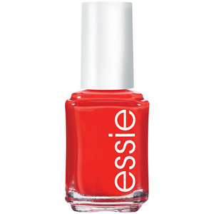
Essie Geranium $8 (beauty.com)

Bright for the perfect sunny day. Essie not only sells high quality nail polish, but also they are sold at low prices. Geranium is perfect for the party you want to take your floral sundress and your cute little jean jacket with your favorite wedges to.

So here are some of my favorites I'm craving for this Spring.
What are yours?

Saturday, March 23, 2013

Thanks for the laugh, American Eagle

Have you ever had jeans that are just... Not skinny enough? Not tight enough? We've all been there, so has American Eagle. AE is now offering "skinny skinny" jeans. You can view the campaign video here. (Caution: said jeans are very skinny.) It appears to be a "Limited Edition" paint-on skinny jeans style that.. Get this, you spray on.

Of course, it is a 
HOAX! 


According to American Eagle, there are only 1,000 of these "special limited edition" skinny jeans, with SkinTight technology that clings to your skin, like, well... A second skin.


Thanks for the laugh, American Eagle. Happy Spring!

Tuesday, March 19, 2013

Vintage Treasures

Hello fashionistas,

My last "Vintage Treasures" post seemed to return quite a bit of positive feedback, so would you all enjoy a (possible) weekly post on vintage I have scoured online? Please comment about whether you'd enjoy that or not, and if not, I promise I will not take up any more space on your monitors with vintage posts!

This week's vintage treasure is not exactly a vintage piece itself, but more "inspired" by vintage, but I find it very adorable and very perfect for spring. It's pastel, for one, a spring must- and it's got a kind of Wild West cowgirl feeling mixed with a downtown girl vibe. AND, lastly, it has ombre, which if you didn't know, I am a real sucker for.

Cowgirl fringe ombre shorts, $150

What do you think? Fashionable or a faux-pas?

Sunday, March 17, 2013

Vogue Magazine Review

Hello my fashionable friends,

It seems (acclaim-wise) that Vogue magazine would be the "it" magazine of today, n'est-ce pas? For example, on my last review of "X Magazine" I was faced with several disparaging comments about how I've judged X too soon to show whether it is a lasting magazine, while Vogue with (whoa), 9 issues, has already proven to be a powerhouse in the industry. But has it... really? It seems the editor-in-chief, Jelinna, has a strong pack of followers who are both loyal and biased. I, fortunately, have not hopped on that train car, and FEAR NOT, dear readers, you can always count on me for a non-biased and detailed review. As always, remember, instead of using page numbers, I use brackets, for example the cover is [1/25]. This magazine contains 25 pages.

Click HERE to view Vogue in a new window to follow along with me.
Graphic Design: 9/10 If anything, Vogue is most famous for it's graphics and it's graphics are probably the #1 reason why Vogue even has the following it does. My favorite graphics have to be the Spring Trends [4/25], although I must say the shading and make-up is a bit strange at parts [5/25] and [17/25] and I feel Jelinna has gotten a bit sloppy at times. Because she has already set such high standards for herself, I was expecting more consistency, which I did not see at all times. Vogue is no longer a fledgling magazine- it must bring to the table the same high standards it has set for itself consistently, in every single issue.

Fashion Editorial: 4/10 Uh... excuse me? Where is your editorial? What I find funny is that there is no theme whatsoever throughout the magazine. It's confusing and not fluid and I see what should be an article in "When I Doubt Wear Red" [8/25], yet there is nothing after it: it just switches to something the editor feels is relevant, but in reality- is really not. At all. There's not much to comment on, because, well, there's not much here at all.

Trends Shown: 8.5/10 There's quite a bit of trend shown here... But I wish there was an explanation. Nothing tells me why any of this is even popular [4-9/25]. Honestly, there's no reason why I should buy these clothes in Starplaza. Because Vogue says it's popular, without explanation? Your magazine may be distinguished, but it hasn't gotten to the point where it's a fashion Bible, like the real life Vogue. So, please, do give us some explanation.

Creativity: 2/10 The title itself is one of the least unique, creative ideas, EVER. The reason why it has taken so long to have a "Vogue" magazine on Stardoll is well, because it has been done already. In real life. Everything in this article is so... cliche. Traditionally pretty, with a already done before "Beauty" section [11-13/25]... And a biography of Lady Gaga [17-21/25], like we all don't know who she is. I tried to be kind and return points here, but there is ZERO semblance of originality and creativity... The magazine does not even aspire to. BE DARING!!! I cannot stress this enough.

Writing Style: 2/10 The only points given here are ones for having some words on the page. I did not even bother to read any articles, because there were 2 total "articles" (if even that) in this magazine: a beauty tutorial and Lady Gaga's biography, which, by the way, looks like a copy-and-pasted Wikipedia page to me. Hard hitting stuff, eh? More like a fashion catalog rather than a magazine.

How did this magazine score?
25.5 out of 50 points, at 51% or F

My Final Comments: Truthfully, graphics mean so little in the face of a magazine's value. I promise, open up any magazine from Marie Claire to (the real life) Vogue, and I GUARANTEE you will find articles that are debatable, hot button issues, that interest people. Society events, parties, interesting critiques from experts and original fashion ideas. Vogue really has nothing, besides "pretty pictures." And, even that, seem sloppier than they have been in past issues. I was expecting a higher score, but I am non-biased and will give the score I deem to be fitting. If Vogue does not change, that's fine- just do not expect me to do another review of this magazine in that case: it's not even worth my time.

What do you think TTT? Agree/disagree?
Is there a magazine you think I should review? Tell me!

Saturday, March 16, 2013

Vintage Treasures

Hello my fashionable friends!


I have fallen in love with this vintage Givenchy bracelet (it's made of gold, by the way), but sadly, the price tag is a bit too steep for my taste. Nevertheless, I would love to share with you all this wonderful fashion find! What do you all think about vintage? Would you wear this bracelet? I think vintage is a great way to find inexpensive clothing that is both timeless and for a reduced price!

Givenchy Bracelet, $595


Check back tomorrow for my review of Vogue Magazine!


Thursday, March 14, 2013

Review: X Magazine

How very... Scandalous. 

Dear readers, what we are about to witness is the return of stylish, sexy graphics that are both eye-catching and thought provoking. Yet, on its face, X Magazine seems like the epitome of what a Stardoll magazine should be: but is it? Let us weigh it on the TTT scale and see. As always, remember instead of putting page numbers, I use brackets, for example, the cover is [1/27]. This magazine contains 27 pages.

Click HERE to view X Magazine in a new window & follow my commentary.

Graphic Design: 8.5/10 X establishes a simplistic, monochromatic theme from the cover through to the end. Sometimes, monochrome is the worst possible idea to do because it is too boring- yet X has succeeded in making it work, and I love it. And I mean, love it. From the Chanel ads [3/27] to the editorial [11/27] (and may I say, nice collarbones? Gorgeous!) I am in love. Yet, the X "Trend Report"'s cover graphics [13/27] made me cringe a little bit. Also, the nun's habit does not even touch on fashionable, sorry [21/27]. Coupled together, it's a great start, but could be worked on: may I suggest a little better curating next time?

Fashion Editorial: 8/10 I will go ahead and assume your "Balenciaga" article [9-12/27] is the X version of editorial. It's a novel idea, I like it. Lets roll with it. I love the graphics, as commented on above, the writing is good, yet as a magazine you are facing a problem many other magazines don't: you don't have enough pictures. There are not enough pieces to make this a fashion editorial. Instead of one full outfit, think two or three. Although, all together, I like the idea and I think it is a creative way to not only educate your readers, but also create a magazine that looks to the future.

Trends Shown: 8.5/10 I really like how X broke the trend down into different pieces, however, I feel two or three trends could have been done in this section. One outfit, 3 pages [14-16/27]? My complaints end there, however. I like it. I like the running commentary, I like the outfit, and I think it fits beautifully into the theme X has established here. Good work.

Creativity: 9.5/10 I've seen more creativity in this magazine than any other in awhile. From the new approach on fashion editorials, to the trend breakdowns, to the unique graphics and the creative theme, it's really very good. And, at the end, I love "Controversy" by AislinVictory, [24-25/27]. Simply from the creativity aspect in it, it establishes an idea that magazines can make people think once more: not just mindless catalogues of clothing. This magazine has many interesting articles and themes, I could just swoon.

Writing Style: 8/10 This is where it gets tricky. Historically, I haven't critiqued writing much because other magazines simply do not have any writing whatsoever. This time, I'm faced with the dilemma: there are so many articles, which one should I read? I am selecting a random article, and I am reading "How Religion Influenced Fashion" [21-22/27]. All articles in a magazine should be carefully edited and picked at before publication, correct? So every article in the magazine should be of similar caliber and quality. Here we go: I think the concept is great. I've never thought about religion influencing fashion before: this article is original as it can get. Yet, the author makes a point I cannot quite follow along with at times, and seems to lean towards off topic at a certain point "they take these ideas and inject them into their runway shows almost as a brainwashing scheme..." what? The author makes these interesting points: now show me the facts. Which designers? Which collections? Which year? You gave me the why- how?


How did this magazine score?
42.5 out of 50 points, at 85% or B

My Final Comments: Congratulations X Magazine! I don't think I've given out a B all year! Excellent job all around, and I can see you need to fix some of the details, but I also can see myself giving you possibly an A or A- next time around. Improvements, sure, but you have come pretty close to perfect. I'd say you are in the lead to be the industry's standards.

What do you think TTT?
Check back SUNDAY to read my review on the new Vogue Magazine!!

Wednesday, March 6, 2013

Food For Thought: Aging

Consider this thought.

"Any fear of aging, I think it is simply vanity. Because what comes with age is so many wonderful things: wisdom, understanding." -Leighton Meester

Brigette Bardot in her "glory days" as a young woman.

At some point we begin to think about ourselves aging past this stage of "youth" into mature adulthood, to middle age, and finally to elderly. When we are young, and people ask us what we want to become in life, we answer matter-of-factly with responses such as a policewoman, or a teacher. We live in that state of eternal youth where life seems to stretch into infinite days where life is defined simply. Yet, at one point we all realize the inevitable: parents die, siblings die, pet dogs die, and we, too, will eventually die.

I think this is where the fear of aging comes from. We are afraid of ourselves changing: our youthful, "beautiful" appearances change, and our souls wisen yet our bodies age and devolve. We are vain, yes, but personally I believe that this fear comes from our fears of dying, such as: what are we missing out on once we are dead? What will happen to us? Yet, there is nothing we can do to slow the process. We can remove our wrinkles through injections, get daily facials, or dye our hair to its original state, yet we are still going to age. 

Simply, society is the problem. Society is the root of so many problems. Problems with our body image, our clothing, our looks. Society does not find many elderly women attractive. Why, today I heard this girl talking about Brigette Bardot. "She was so pretty in her twenties," she said, "But now she is ugly. She's like, old. Like, 80 old. How attractive can 80 year old women be?" In my mind, I feel her perceptions are all wrong.
.
Brigette Bardot today.
Yes, she may not be the world renowned beauty she used to be, but she is still beautiful. We simply need to look for the beauty inside ourselves. Finding that beauty, I believe, is the key to our problems. Once we realize our self worth on the inside, corny as it may seem, aging does not seem as scary. Look forward to the day where you can relax after a lifetime of good work and realize you have accomplished and learned so much. Look forward to the day where you will be 80 and still see yourself as beautiful as you were when you were 20. If we can see in ourselves today, can we not make a better tomorrow for us all?

What's your opinion? Comment!

Monday, March 4, 2013

Debate: Vogue Magazine, Setting Industry Trend?


Does Vogue magazine set the industry trend?
Of all the magazines today, is Vogue the best one out there today? 

GIVE US YOUR OPINION! 

Friday, February 22, 2013

Haute Magazine Spoiler

Dear readers,

Happy Friday! Check out what is in the bag of surprises... The Haute Magazine Spoiler! With Spring just around the corner, the Haute team is bringing us happiness for the upcoming season.


Click HERE to view Haute Magazine. It looks edgy, but the graphics look a big lopsided, especially near the face. The body itself is done rather well, and I like the tattoos! Loving the idea and the theme.

Have a great weekend, everybody!

Tuesday, February 19, 2013

Review: Trendy Magazine

Dear readers,

I must confess I am a bit late to the party, but here goes my belated commentary for Trendy Magazine. Trendy is setting the industry standard as of now, created by two of Stardoll's contemporary "elites." Whether or not Trendy will match the best of the best will be determined on here, on my scale. Remember that in a magazine, instead of putting the page numbers, I will use brackets. The cover is [1/34]. This magazine contains 34 pages.

Click HERE to view Trendy in a new window to follow along with me.
Graphic Design: 10/10 Trendy is eye catching from the start: SEXY, SEXY, SEXY! It's not blatantly, or overtly so, however, and I love it. It's simple but the headdress on the cover makes the cover dazzling. The hair is pure disarray and the color is fantastic. I love the simple but not overstated theme, especially with the headdresses right off the bat [4/34] and the Christian Louboutin graphics [14/34]. Oh, sweet seduction! I could gasp over these gorgeous graphics all day but I must move on: I'll leave you with two words. Elie Saab [20/34].

Fashion Editorial: 7/10 It saddens me to give the editorial these marks, but although the graphic design is close to perfection, the editorial is far from so. There's no fluidity, no theme [19-25/34] and there is nothing that is an indicator to what the editors are looking for. No curated pieces are shown, and in the photo where she is topless [25/34], she looks great, but what's her purpose? Why is she topless? Important questions.

Trends Shown: 9.5/10 The trends from Paris Fashion Week were great [6-11/34]. I loved the editors picked their favorites and displayed them. This is what it means to be trend setting! Points off for no real explanation though, and as with the editorial, no fluidity. I loved the "Must Haves" section [15/34] and the casual trendy looks that are so ideal for Spring [16-17/34].

Creativity: 6/10 As magazines go, this wasn't cutting edge. It was alright. However, as magazines go today, this was one of the better ones. Though the creativity wasn't mind blowing, the darker overall theme did entice me and was one of the magazine's best assets.

Writing Style: 4/10 It is here Trendy falls into a trap. We see yet another magazine with little to no writing, thinking they can make up for it with pretty pictures. Words provide sustenance. The interview with Manolo. DiCicco was good [28-30/34], something that has not been done for awhile. Otherwise, the grammar and writing style was fine, I just really wish there was more.

How did this magazine score?
 36.5 out of 50 points, at 70% or C

My Final Comments: Trendy was a good magazine. The graphics were great but a magazine's worth does not directly stem from good graphics. They are important, but other areas were lagging. Writing, for example, should be essential. I feel so many magazines, as a general consensus, lack the adequate amount of writing necessary for it to be a true publication, not just a high fashion catalog. That was my main complaint. Last time I reviewed Trendy, it seems the magazine's editors haven't taken my words to heart. The score hasn't changed. I am looking forward to giving Trendy higher scores in the future.

TTT, what did you think? Agree or disagree? Comment!

Sunday, February 17, 2013

Now Magazine Spoiler


Now Magazine is the newest in the strand of magazines coming out in our hypothetical "Dollywood" and is probably one of the better spoilers I've seen around. Of course, I cannot vouch for the quality of work that will be presented to me. The graphics aren't the clearest, but it is evident the magazine's team is looking at a more dreamlike version, fantasy, if you will, of Stardoll. It remains to be seen if they can pull it off or not. The color scheme is good, there needs to be more of a contrast between the foreground and the background, but overall I have nothing more to say.

Click HERE to visit Now Magazine!
TTT, what did you think? Agree or disagree? Comment!

Friday, February 15, 2013

Review: Allure Magazine

Welcome back, TTT readers,

Happy V-Day everybody! I hope you got a kiss from that special someone, and if you didn't, I hope you got some chocolate kisses! And, to complete your Valentine's Day, without further adieu, here's my delicious review of the newly released Allure Magazine. And, I must say, there could not be a more auspicious time to publish a magazine: kudos to the Allure team! Bonus points awarded (just kidding, I don't do bonus points). Well, enough rambling, let's get down to business.

Allure's first issue is the quality of a fledgling magazine, which is no more than I truly expect for a first issue. It was not a smashing success, or a complete failure, but somewhere along the lines of ok, and moving upwards on the ladder. The Allure team has a lot going for them, however: Allure is also a daily blog, which I must give commend to: it is really hard to run a blog and a magazine at the same time! As always, to prevent from making this post too boring, I will put page numbers in brackets. For example, since this magazine has 25 pages, the cover would be [1/25]. It makes it easier for all of us.

Click HERE to view the magazine in a new window to follow along.

Graphic Design: 7/10 The graphics are not too bad, and actually get progressively better from the cover on. The hair on the model is too choppy and quite frankly too large for her face, but her face is beautifully sculptured. I like the "peek-a-boo" nudity risks that the magazine takes: it is daring for a first issue, but well composed and while does tread a fine line between art and porn, does not cross it [5/25]. Impressive. The editorial picture does look a bit awkward, however, as the models look like little girls caught in a child's pose [10/25], but maybe that's the photographer's job to work on the poses a little better: think refined- Coco Rocha! I like the daring chances the team took, however, for example, Lindsay Lohan smoking the cigarette [21/25]. Well done, but it needs work and refinement.

Fashion Editorial: 4/10 The editorial was 2 pages long. And a 4/10 is me being generous. Well curated fashion magazines have a spread of fashion usually: and this is the best time to have one! We are nearing Spring and the magazine could have easily, easily incorporated more clothing. But what I do like are the floral crowns [10/25], always a good trend, yet the girl with the wolf confuses me. This seems more along the lines of a fall edition, no?

Trends Shown: 8/10 What this magazine excelled at was trends. Huge commendation for the specific article on trends. I really liked how specific the writers were [6-9/25] and the clue-ins. Ombre hair is truly hard to do yourself- appealing to the "everyday girl" that is your reader is absolutely important! Yet, there were no pictures on hand to show what the final style should look like, and that's where the points came off.

Creativity: 6/10 This magazine had nothing out of the normal. Yes, it is edgy, but we can also say Wooldoor's Monster is edgy. My point is, it's not the only one out there. The points come from the "Playlist" article [13-15/25], where there is something new. Music has not been a topic yet explored by any magazine, and I am impressed the team has thought of it. I love that the author puts her own opinion into it, and why it means so much. This article made me really, really, happy. Overall, though, the magazine needs to follow this concept of originality.

Writing Style: 7/10 The writing style and grammar were good all around. Yet, I am upset that there was no real article. Where is the substance! Yes, fashion and style is important, but there are also tons of issues your readers could be more informed about. A new art exhibit? Fashion week? Politics? Looming issues such as melanoma and the use of tanning beds? Food for thought.

How did this magazine score?
32 out of 50 points, at 64% or D-

My Final Comments: Allure has done very well, although many fans and the team may think I was a bit unfair. This scale is one created for magazines that have run for many seasons, for improvement, and for people to read magazines with a more critical eye and get the most they can out of every issue. I don't believe I was unfair, and I believe Allure has a lot of improvement ahead but it has started at a very positive place. I look forward to awarding Allure with high marks in the near future!

Tuesday, February 12, 2013

Run Magazine Spoiler


So, today, Run Magazine has released Spoiler #3 to their upcoming magazine. And, well, looking at the spoiler, it kind of makes me want to run... In the other direction. No offense or anything, but personally I think the Run Magazine team should lay off on the hallucinogens and give their magazine a good look before publishing it... Remember, first impressions are everything... And I'm sensing an F on my scale. Please let me know when the house of horrors has passed through, since Run has given me QUITE the Stardoll scare that I haven't experienced since the first edition of Stardoll "Playboy," which- believe me, was terrifying in its own right. I am sensing a dark, cutting/suicidal version of Lana del Rey. That has quite the bad taste on my mouth. On that note, I'm bidding you all a happy Tuesday!!

What do you think Run Magazine will look like? Do you agree, or disagree with me? Comment!
Click HERE to visit Run Magazine.

Also, personal question: how is everybody liking New York Fashion Week?? 


Fashion lovers, tell me all! As a native New Yorker, I love seeing models out and about on the streets!! So style smart & chic, and gorgeous! Last year I met Karlie Kloss, my idol. Who would you like to meet at NYFW? If I get an autograph, I might give it away...

Monday, February 11, 2013

Review: Trendy Magazine

Hi Today's Top Trends!

I'm Sierra, or otherwise known as iswim19 on Stardoll. I'm the new magazine reviewer, and I'll be bringing you unbiased, factual reviews. If you have a magazine that you feel should be reviewed, message me or leave it in the comments and I'll be sure to get to it! In this magazine, there are 19 pages, so if I say page [4/20], then flip to page 4 to see my meaning. Thank you guys for understanding!

Trendy Magazine editor-in-chief Pau.Cam.Arena has sent out a smashing first edition, and here at Today's Top Trends we just want to make it better. Here at TTT I will break down the magazine and offer constructive criticism, totaling a final score out of 50 points to see what grade Trendy will get.

Click HERE to go to Trendy Magazine to follow along with my review.
Graphic Design: 9/10 The graphics were beautiful and well done, as well as showing a constant consistency throughout the magazine. Though they could be more realistic, it is extremely good and articulate. I love the detail in the Lanvin photoshoot [3/19] and fell for the cream colored editorial [11/19] along with the minimalistic prints shown throughout the magazine [12/19]. I found this well done for the winter-spring transition and the festive lights on the cover just simply seal the deal for me. Excellent graphics for a first issue, I'm expecting big things!

Fashion Editorial: 6/10 The clothing is fabulous, and well curated, and that is the only place the 5 points came from. I found that there is no explanation for why the clothing is chosen, and no theme for the entire magazine. There is nothing on the cover, and nothing throughout the editorial [11-14/19]. Pretty clothes aren't enough. I need to know why and the meaning. This is a magazine, not a catalog, right?

Trends Shown: 8/10 I like that the "Trend Zone" [4/19] is clearly marked in a magazine: but is it not too blatantly obvious? The point is to integrate the readers' mind with the purpose of your magazine, not to bludgeon it into their brain. Tread lighter next time. The background and the strange text makes it a bit difficult to read, yet the gold, black, and army colors are just right for the season [5-8/19], and I simply cannot fault that. There must be improvements made, but I'm not disappointed.

Creativity: 7/10 One or two years ago, Trendy Magazine would simply be another average magazine on Stardoll, but since then the quality of work has rapidly declined. Today, Trendy Magazine is one of the best. I'm not saying they ever would be considered bad: it's just that it is not as good as Eternity or Fierce, but yet few can compare to Mary and Alice, which is why they are forever immortalized, correct? I simply do not see anything really new, but I am ready to give points where points are deserved.

Writing Style: 5/10 I basically had nothing to critique, except for maybe a description of Burberry's history [17/19]... Am I supposed to look at the historical accuracy? There's nothing that is debatable, questionable, or with true sustenance. It looks hastily written, and, by the way, the last word is missing a period. I noticed that Trendy wants to create a new magazine every month: may I suggest to make it every 2-3 months? To add more sustenance to your blog. Vogue may appear every month, but Vogue has a full team that works full time, around the clock, to bring you the glossy magazine, while I am sure Trendy does not. Take your time. Make it perfect.


How did this magazine score?
35 out of 50 total points, at 70% or C

My Final Comments: I was a bit disappointed this magazine scored so low, but if anybody knows anything about my critiques, they tend to be much harsher than most, and I believe the highest score I've ever given out was around an 86%. I hold magazines to an extremely high standard matched by few so the improvements will be great. I hope the owner of this magazine takes this to heart, and works on the improvements I have suggested. This magazine is still young, in its' baby years, and as it matures I can see really great things someday. Best of luck, Trendy, and do not give up! 

TTT, I want to know what you think! Leave your comments below and I'll be reading them all!