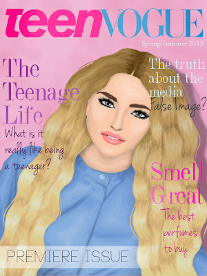
In recent days the first edition of Teen Vogue was released. Comparisons to Teen Style have been made although this particular Teen Vogue (hollyoaksrocks*) actually holds no connections with the success story of Vogue Magazine, controlled by the powerhouse Jelinna... which will certainly make things confusing if Jelinna does perhaps wish to one day create a teen edition of her popular magazine.
THE COVER: I personally believe that the cover of any magazine must be a strong point to entice readers into the issue. I cannot say that this cover did that.
Firstly, the text on the cover explains the truths of the average teenager in this current time, the truth of media and how teenage years which are often portrayed as girly and fun times in many media assets often do not live up to their description...
From this I feel as though the cover graphic really contradicts the whole message Khol is trying to send out. The rough truths of teenage life and media attention?... The cover certainly isn't telling me that.
I also dislike the placement and variety of texts used on the image. Anyone that knows me is aware of my thoughts on texts on covers so I was slightly baffled again by the cutesy and colourful writing used on the front image of the magazine.
GRAPHICS: For a magazine that lacked any real content I was slightly surprised to see the small amount of graphics, with there only being 6 proper images in total, without counting the double usage of the cover graphic. Another thing that particularly confuses me about the magazine is the lack of theme or any real organisation. The few graphics in the magazine are placed in completely random positions and don't have any relevance, on a whole, to the surrounding articles (or lack of articles... again). On a positive note, the graphics the magazine did have were all well made.
EDITORIALS: On the contents page it reads "Fashion Editorials" Hm. There were none. I personally would consider an editorial 2 or more graphics showing one prominent theme or trend. I failed to see this, which once again could be down to the random placement of the graphics.
Creativity: I would have awarded points to the creativity of the teen inspired topics but considering the length and lack of proper formatting of the two teen articles shown they won't be given.
WRITING STYLE: As mentioned previously there were a very small number of articles, a small amount of content and an oddly large amount of pages for a perfume editorial. The two teen inspired articles consisted of one page and big writing. The reasonably interesting article on Marina & The Diamonds is sadly nothing more than a copy and paste job from Wikipedia being the only proper length article the magazine has. I dislike the way the two mini articles on teens are set out but the message behind them is a good one, and written better they could have been very good.
OVERALL: For a first issue it's alright, nothing overly special but nothing bad either. There is no real theme or content and it all seems to be a bit of a jumble of pages. I have high hopes for this magazine as I believe with a stronger theme, Khol's great ideas and better management and organisation it could do very well. What are your thoughts on this magazine?


Agreed.
ReplyDeleteI agree completely!
ReplyDelete:)
ReplyDeleteGood review.
ReplyDeleteVery nice review.
ReplyDelete