Thursday, February 28, 2013

Fashion Exam #4


Hey dolls! We're back for a new term! 
To start off with a bang we have two very interesting outfits to mark.


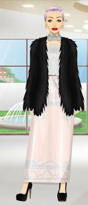
Cooldeer123 (tania) and Emmahunt4 (hilmy)

Guys, what is going on? Tania: I sort of like it but then I don't. The hat is ridiculous and doesn't go with the outfit, along with the random leopard print bag. The rest is nice though.
Hilmy: I don't even know what to say, what the hell are you doing? Firstly you have this horrendous sweater then you have some tin foil gloves and boots. Are you attempting to cook yourself? 

Well say no more, here are you grades;

Tania                                
                                          
Outfit = D-                         
Shoes = B                          
Makeup = C                       
Hair = C                             
                                           
Overall Grade = C- or 65%
                                         

Hilmy                               
                                         
Outfit = G                         
Shoes = G                         
Makeup = D                      
Hair = C                            
                                          
Overall Grade = F or 40%


Well, Tania you just about passed! but Hilmy, you failed badly,

Tania you passed with a C- / 65% - The outfit was just too quickly put together in my opinion. 
Hilmy you failed with an F / 40%  - Nothing could of helped this outfit, maybe if you burnt it, you would of got an A.


Until next time,


Khol X


Wednesday, February 27, 2013

It's Back, Fashion Exam


COMING TOMORROW.

Fashion Battle #5

*This is the final in the series of 5 fashion battles*
gkmktk VS to_royal

Colour focus is a staple trend in which all of the outfit is focused on one signature colour. I'm in love with both these fall style looks, with gkmktk rocking multiple shades of brown and Deidra layering up in black. Who is your favourite? Comment below.

Monday, February 25, 2013

Oscars Best Dressed

In honor of The Oscars, I've decided to hold a best dressed for this special occasion. Want to apply for the best dressed? Save your medoll to your album, and post the picture in your presentation. This is because you might just see yourself on the red carpet... literally!

Here's the form...
Name (first, last):
Username:

Good luck!

Sunday, February 24, 2013

Fashion Battle #4

Jellina VS. MandaMichalka

Both outfits are only based on one dress but both make wonderful outfits.
You know the dill. Vote in the comments below on your favourite outfit.
Jelinna wears: PPQ One Shoulder Printed Peplum Dress
floral ring clutch, black platforms and black and silver beaded necklace
MandaMichalka wears: Velvet Orchid Dress
floral socks, platform heels and LE studded clutch

Saturday, February 23, 2013

A Change in Perspective

After a rather long day, I got a refreshing guestbook comment, and to say the least, it made my day, or rather rest of the day.

Intrigued, I visited Perspective.

According to her/him, they are doing this for a good reason. I thought it was really kind to go around and give compliments to various stardoll users. So, in an end to a good-turned-great day, thank you perspective, this is just what Dollywood needed.

What do you think of what she's/he's doing?

The Best Dressed List

Ladies and gentleman, boys and girls, we proudly present you the TTT best dressed list! It's been processing with a tad bit of procrastination but thankfully and finally ended up being completed. Without further adieu let us call the imaginary curtains and get on with the show!

lindamissanto
Gladis: WOW that detailing is spectacular! Everything is perfect, and you look red carpet ready. It all goes really well, the only problem I think (for me, anyway) is the dress is too short for the idea and other accesories. Props for the sleeve top thingy idea though! 10/10

Kimberly: There is no denying you look very glamorous, even with those oddly vivid bright blue eyes... My only concern is it's slightly bland, it's all very tan and gold coloured and I also think the bag is quite awkwardly placed BUT it is a very beautiful outfit and I love the detailing on the dress. 9/10

_________________________________

ChocoMushroom
Gladis: WHAT 3/10

Kimberly: I usually love your looks when I visit your suite but I genuinely do not understand this outfit. I have no idea where you are trying to go with it. 3/10

__________________________________

emmahunt4
Gladis: I like  this outfit! It's very classy but not too much which I think laces with Emma's personna. My favorite part would be how the stud accents mimic the style of the shoes, wrapping up the entire outfit. The downside for me is that purse, and the hair. 8/10

Kimberly: I like it. It's very simple and I love the stud accents but the hair really puts me off. I think a gold belt could have completed the outfit nicely. 6/10

__________________________________

AislinVictory
Gladis: Wow! Aislin looks like a crystal princess! I really like her model-like face. The outfit is gorgeous but I would have picked more subtle shoes and jewerlly since the main focus is that dress. 8/10

Kimberly: I really love the way you've incorporated that Wild Candy dress into the beautiful outfit. I think the bag throws me off a little bit and you could have possibly chosen more subtle shoes, but I'm really loving this. 8/10

__________________________________

MandaMichalka

 Gladis: OMG!!! This is beautiful, enough said! 10/10

Kimberly: I love this. Honestly, I don't think I can name a negative about this outfit. It's compostion is beautiful and the use of black, white and silver works so well. It's also the first time I've ever seen someone make them LE shoes look good. 10/10

__________________________________


EllieCase
Gladis: It's okay..not a lot to look at. There isn't really any wow factor except for that clutch. 4/10
Kimberly: It's a very simple outfit. It is nice enough but it isn't eye catching or striking in any way. 4/10

__________________________________

Coffeerun
Gladis: I like the hair. 2/10

Kimberly: I don't like this. The outfit does not really flow together, and though the seperate pieces are nice it doesn't work as one. A miss for the outfit, but thanks for being a fun guest at the awards itself! I also enjoy the hair. 3/10

__________________________________

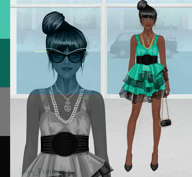
Laia_fergusson_
Kimberly: Somebody's looking fierce. 10/10
Gladis: Sexy! 9/10

CONTINUED AFTER THE BREAK

Friday, February 22, 2013

Haute Magazine Spoiler

Dear readers,

Happy Friday! Check out what is in the bag of surprises... The Haute Magazine Spoiler! With Spring just around the corner, the Haute team is bringing us happiness for the upcoming season.


Click HERE to view Haute Magazine. It looks edgy, but the graphics look a big lopsided, especially near the face. The body itself is done rather well, and I like the tattoos! Loving the idea and the theme.

Have a great weekend, everybody!

Fashion Battle #3

L; Sparklewand12 R; Laia_fergusson_
From fresh and Summery to dark and daring, who wins this week's fashion battle?
Vote in the comments section below.

Thursday, February 21, 2013

Weekly Hot Buys 3: 80's Revival

Rise and shine, dollies! The release of another weekly Hot Buys means it's time for another review segment! I've got to say, honestly, this week's release didn't really meet my expectations. In fact, it fell a little far from it, however there were some pieces which had excellent components.

To begin with, the Oversized Sunnies fell almost in the middle of the spectrum. The neon green frames studded with black painted-on dots was more an eyesore than it was eye-protection. The lenses, I thought, were pretty nicely made, but the frames did them no service. They did however, live up to their name; being definitely oversized, and not in a good way, unless you enjoy looking like you have eyes that should probably belong on a fruit fly. 

The Bling Lips Necklace was probably the nicest item in the whole collection. I thought the subtle black ribbon threaded through the heavy gold chains were a stylish complement to each other, not to mention a recent growing trend in today's fashion. However, the waxy red lips dangling from the thickly strung-together necklace wasn't too flattering, especially considering that they were studded with very fake-looking diamond studs placed awkwardly in the middle of the parting lips. 

Next, we've got the Blue Brocade Coat, which, surprisingly, didn't turn me off as soon as I saw it. I really think that maybe if you paired it with accurately matching jewelry or accessories you could pull it off. The composition of the design was very nice; you could really get a close look at the well-made texture. Think me unreasonable, but I really do find the sleeve-angle rather awkward. I think it honestly would have looked better if our mannequin remained sitting with her arms bent.

The Electric Blue Bag was supremely mundane. Nothing really special about it, and nothing that I particularly liked or disliked.

Lastly, the Hot Pink Heels hardly left a good impression with the closing of this week's releases, although I will compliment the shading on the heels, even though it could use a bit more blending.

In total, this collection scored a D.

As much as I can't wait for the next collection, I really hope they try something more unique and less overplayed in regards to the theme. 


**Apologies for not being able to get a decent picture up. If you're wondering, yes, I did have to screenshot an image, due to the fact that I didn't receive the legitimate advertisement of the collection. 

Wednesday, February 20, 2013

TTT Competitions and Events!


I'm writing to announce the upcoming competitions and events happening here at TTT:

-1,000 Follower Raffle where YOU can win 1,000 Stardollars
-Easter Rare Hunt, Prizes will be announced nearer to the time
-TTT Easter Outfit Competition!
-A SURPRISE COMPETITION, THAT CAN GET YOU A BIG SURPRISE!

We'll announce the dates nearer the the time since as of yet, We really don't know when
the dates should be.

Thanks, 
Reece (Head of Competitions and Events)

Tuesday, February 19, 2013

Review: Trendy Magazine

Dear readers,

I must confess I am a bit late to the party, but here goes my belated commentary for Trendy Magazine. Trendy is setting the industry standard as of now, created by two of Stardoll's contemporary "elites." Whether or not Trendy will match the best of the best will be determined on here, on my scale. Remember that in a magazine, instead of putting the page numbers, I will use brackets. The cover is [1/34]. This magazine contains 34 pages.

Click HERE to view Trendy in a new window to follow along with me.
Graphic Design: 10/10 Trendy is eye catching from the start: SEXY, SEXY, SEXY! It's not blatantly, or overtly so, however, and I love it. It's simple but the headdress on the cover makes the cover dazzling. The hair is pure disarray and the color is fantastic. I love the simple but not overstated theme, especially with the headdresses right off the bat [4/34] and the Christian Louboutin graphics [14/34]. Oh, sweet seduction! I could gasp over these gorgeous graphics all day but I must move on: I'll leave you with two words. Elie Saab [20/34].

Fashion Editorial: 7/10 It saddens me to give the editorial these marks, but although the graphic design is close to perfection, the editorial is far from so. There's no fluidity, no theme [19-25/34] and there is nothing that is an indicator to what the editors are looking for. No curated pieces are shown, and in the photo where she is topless [25/34], she looks great, but what's her purpose? Why is she topless? Important questions.

Trends Shown: 9.5/10 The trends from Paris Fashion Week were great [6-11/34]. I loved the editors picked their favorites and displayed them. This is what it means to be trend setting! Points off for no real explanation though, and as with the editorial, no fluidity. I loved the "Must Haves" section [15/34] and the casual trendy looks that are so ideal for Spring [16-17/34].

Creativity: 6/10 As magazines go, this wasn't cutting edge. It was alright. However, as magazines go today, this was one of the better ones. Though the creativity wasn't mind blowing, the darker overall theme did entice me and was one of the magazine's best assets.

Writing Style: 4/10 It is here Trendy falls into a trap. We see yet another magazine with little to no writing, thinking they can make up for it with pretty pictures. Words provide sustenance. The interview with Manolo. DiCicco was good [28-30/34], something that has not been done for awhile. Otherwise, the grammar and writing style was fine, I just really wish there was more.

How did this magazine score?
 36.5 out of 50 points, at 70% or C

My Final Comments: Trendy was a good magazine. The graphics were great but a magazine's worth does not directly stem from good graphics. They are important, but other areas were lagging. Writing, for example, should be essential. I feel so many magazines, as a general consensus, lack the adequate amount of writing necessary for it to be a true publication, not just a high fashion catalog. That was my main complaint. Last time I reviewed Trendy, it seems the magazine's editors haven't taken my words to heart. The score hasn't changed. I am looking forward to giving Trendy higher scores in the future.

TTT, what did you think? Agree or disagree? Comment!

Noelle Back?

Is Noelle (noelle_page) back? Check out the following print screens:

(click image to enlarge)

(click image to enlarge)

What do you think? Do you think Noelle will bring MDM back to its previous state? I'd certainly be excited to see her (in words of Noelle), revive the blog!

Comments?

Sunday, February 17, 2013

Now Magazine Spoiler


Now Magazine is the newest in the strand of magazines coming out in our hypothetical "Dollywood" and is probably one of the better spoilers I've seen around. Of course, I cannot vouch for the quality of work that will be presented to me. The graphics aren't the clearest, but it is evident the magazine's team is looking at a more dreamlike version, fantasy, if you will, of Stardoll. It remains to be seen if they can pull it off or not. The color scheme is good, there needs to be more of a contrast between the foreground and the background, but overall I have nothing more to say.

Click HERE to visit Now Magazine!
TTT, what did you think? Agree or disagree? Comment!

Saturday, February 16, 2013

Best Dressed List

Name:
Username:
Link to outfit:

Comment below.

WINNER: Doll Of The Year

OF 2012:
HOLLYOAKSROCKS*
Khol starring in an upcoming magazine soon to be released
2011:
SEVILLANA94
Chris seen in Posh Magazine (Chace.Clark)

WINNER: Overall Fashion Icon

AN EXCLUSIVE AWARD AS CHOSEN BY MDC
LAIA_FERGUSSON_

WINNER: Most Trendy Doll

AN EXCLUSIVE AWARD AS CHOSEN BY MDC
EUGENIES

WINNER: Edgiest Doll

AN EXCLUSIVE AWARD AS CHOSEN BY MDC
FRICSHOW

WINNER: Editor's Choice


WINNER: Ultimate Magazine


2nd. Eternity
3rd. Vogue
4th. Fiece

WINNER: Stardoll Friendship

JACK AND KHOL

WINNER: Controversy Queen

JELINNA
VOTED WINNER FOR VOGUE SCANDAL SURROUNDING MODEL HOUSE 

WINNER: Best Collector


WINNER: Top Event


WINNER: Classic Style Icon

SEVILLANA94
Photo Credit: Stardoll Fashion Cats

WINNER: Top Project


WINNER: Top Model

BLUEGREEN86
Mel on the cover of Eternity Magazine

WINNER: Best Blog


PARTY


Friday, February 15, 2013

Review: Allure Magazine

Welcome back, TTT readers,

Happy V-Day everybody! I hope you got a kiss from that special someone, and if you didn't, I hope you got some chocolate kisses! And, to complete your Valentine's Day, without further adieu, here's my delicious review of the newly released Allure Magazine. And, I must say, there could not be a more auspicious time to publish a magazine: kudos to the Allure team! Bonus points awarded (just kidding, I don't do bonus points). Well, enough rambling, let's get down to business.

Allure's first issue is the quality of a fledgling magazine, which is no more than I truly expect for a first issue. It was not a smashing success, or a complete failure, but somewhere along the lines of ok, and moving upwards on the ladder. The Allure team has a lot going for them, however: Allure is also a daily blog, which I must give commend to: it is really hard to run a blog and a magazine at the same time! As always, to prevent from making this post too boring, I will put page numbers in brackets. For example, since this magazine has 25 pages, the cover would be [1/25]. It makes it easier for all of us.

Click HERE to view the magazine in a new window to follow along.

Graphic Design: 7/10 The graphics are not too bad, and actually get progressively better from the cover on. The hair on the model is too choppy and quite frankly too large for her face, but her face is beautifully sculptured. I like the "peek-a-boo" nudity risks that the magazine takes: it is daring for a first issue, but well composed and while does tread a fine line between art and porn, does not cross it [5/25]. Impressive. The editorial picture does look a bit awkward, however, as the models look like little girls caught in a child's pose [10/25], but maybe that's the photographer's job to work on the poses a little better: think refined- Coco Rocha! I like the daring chances the team took, however, for example, Lindsay Lohan smoking the cigarette [21/25]. Well done, but it needs work and refinement.

Fashion Editorial: 4/10 The editorial was 2 pages long. And a 4/10 is me being generous. Well curated fashion magazines have a spread of fashion usually: and this is the best time to have one! We are nearing Spring and the magazine could have easily, easily incorporated more clothing. But what I do like are the floral crowns [10/25], always a good trend, yet the girl with the wolf confuses me. This seems more along the lines of a fall edition, no?

Trends Shown: 8/10 What this magazine excelled at was trends. Huge commendation for the specific article on trends. I really liked how specific the writers were [6-9/25] and the clue-ins. Ombre hair is truly hard to do yourself- appealing to the "everyday girl" that is your reader is absolutely important! Yet, there were no pictures on hand to show what the final style should look like, and that's where the points came off.

Creativity: 6/10 This magazine had nothing out of the normal. Yes, it is edgy, but we can also say Wooldoor's Monster is edgy. My point is, it's not the only one out there. The points come from the "Playlist" article [13-15/25], where there is something new. Music has not been a topic yet explored by any magazine, and I am impressed the team has thought of it. I love that the author puts her own opinion into it, and why it means so much. This article made me really, really, happy. Overall, though, the magazine needs to follow this concept of originality.

Writing Style: 7/10 The writing style and grammar were good all around. Yet, I am upset that there was no real article. Where is the substance! Yes, fashion and style is important, but there are also tons of issues your readers could be more informed about. A new art exhibit? Fashion week? Politics? Looming issues such as melanoma and the use of tanning beds? Food for thought.

How did this magazine score?
32 out of 50 points, at 64% or D-

My Final Comments: Allure has done very well, although many fans and the team may think I was a bit unfair. This scale is one created for magazines that have run for many seasons, for improvement, and for people to read magazines with a more critical eye and get the most they can out of every issue. I don't believe I was unfair, and I believe Allure has a lot of improvement ahead but it has started at a very positive place. I look forward to awarding Allure with high marks in the near future!

Wednesday, February 13, 2013

Weekly Hot Buys 2: Gothic Lolita

After reviewing the latest edition of the weekly Hot Buys, I've surmised that a Gothic Lolita theme has definitely been in contemplation, not only with the Hot Buys, but with the latest Sunny Bunny collection, as well. However, I am a total sucker for Sunny Bunny, and my inner 10-year old little girl is telling me to truly enjoy this week's Hot Buys collection.

I thought I'd start on a good note with the Gothic Lolita Top. Honestly, I really thought it was a blast from the past in regards to overall composition, and it was certainly versatile enough to be paired with something as mundane as a pair of colored skinny jeans to a fitted pencil skirt. The only part of it I didn't find too appealing were the peplum ruffles. Personally, I was never a real fan of that trend, but the shading on that addition was definitely reminisce of something I'd have seen in an earlier Hot Buys collection, which is always a good thing. The creases and wrinkles in the puffed sleeves also deserved honorable mention, just because I loved the classic way they worked with the lace on the front. 

The next item, the Teal Tutu Skirt, was a bit of a far cry from anything as decent as the aforementioned piece. I found it a little awkward, composition-wise, with the shape reminding me of a lamp shade. The teal undertones weren't too awful in the color combination, but again, the translucent black and teal tulle underneath the skirt itself looked like tissue paper to me. Overall, not too attractive, although I'm sure you could cover up it's mediocrity by pairing or layering it. 

The Gothic Lolita Tights were, again, not one of my personal favorites. My dislike for them stems from the fact that I can't stand the color purple, so make of it what you might in your own circumstances. However, I will say that the design is simplistic enough, but the color makes it rather difficult to create subtlety or pair it with an ensemble. "Stand-alone" pieces like these are the wild cards in a Hot Buys collection.

And finally, to sum everything up, I'll finish with the Strappy Platforms, and there is really only one word that I'd use to describe them: fabulous. Do my eyes deceive me? Are those shadows that I'm seeing underneath the straps? And the light reflections on the front of the shoe itself were lovely. Although they aren't anything special design-wise, considering there have been a few items in the Starplaza that looked practically the same, I'd still give them an A+ for composition.

Taking everything into consideration, I'd probably give it a B- total. 

I'm glad to see that Stardoll has been taking a few steps in the right direction with this week's release. It certainly gave me some hope and raised the bar for next week! Until then, dollies.

Tuesday, February 12, 2013

Weekly: Black Focus

Weekly Fashion Favourite: Pretty in Love 'Hot Buys Skirt'
Overall Fashion Must Have: Basic Totes

Look 1: Decades Sabrina Top, Decades Le Smoking Jacket, Pretty in Love Hot Buys Skirt, Archive Black Leggings, Basics Black Tights, Basics Orange Tote, Basics Black Oxfords, Fallen Angel Heavyweight Black Platforms, Tingeling Diamond Crochet Belt
Look 2: Basics Black Tank Top, Fallen Angel Lace Tank, Bonjour Bizou Hot Buys Garter Tank, Spring Surprises Star Printed Skirt, Archive Black Leggings, Basics Black Tights, Antidote White PVC Stars Purse, Fallen Angel Heavyweight Black Platforms
Look 3: Pretty in Love Hot Buys Skirt, Front Row Leopard Jacket, It Girls Heidi Klum (scarf), Voile S-S top, Rio belt, DKNY Red Pleather Purse, Archive Black Leggings, Basics Black Tights, Fallen Angel Metal Stripe Heels
Look 4: Pretty in Love Hot Buys Skirt, Archive Black Leggings, Basics Black Tights, Basics White Tote, Decades CC Belt, Chanel Black Victorian Button Boots, Decades Le Smoking Jacket, Wild Candy Kente Cloth Dress
Look 5: Fallen Angel Metal Stripe Heels, Nelly.com Holiday Hot Buys Tiger of Sweden Bag, Decades  CC Belt, Decades Le Smoking Jacket, It Girls Maggie Blouse, Doll Space Black Dress, Fallen Angel Lace Tank, PPQ of Mayfair Midnight Velvet Harem Pants
Look 6: Special Offer Black Waxy Trench Coat, Mortal Kiss Sheer Maxi Skirt, Fallen Angel Fallen Skirt, Bonjour Bizou Checked Clutch Purse, Fallen Angel Metal Stripe Heels

I will be scouting for users to participate this segment. I will visit the users suite daily and capture all the outfits they create from the week and add them into a post along with the clothing and items in their outfit. Hope you enjoyed the post.

Run Magazine Spoiler


So, today, Run Magazine has released Spoiler #3 to their upcoming magazine. And, well, looking at the spoiler, it kind of makes me want to run... In the other direction. No offense or anything, but personally I think the Run Magazine team should lay off on the hallucinogens and give their magazine a good look before publishing it... Remember, first impressions are everything... And I'm sensing an F on my scale. Please let me know when the house of horrors has passed through, since Run has given me QUITE the Stardoll scare that I haven't experienced since the first edition of Stardoll "Playboy," which- believe me, was terrifying in its own right. I am sensing a dark, cutting/suicidal version of Lana del Rey. That has quite the bad taste on my mouth. On that note, I'm bidding you all a happy Tuesday!!

What do you think Run Magazine will look like? Do you agree, or disagree with me? Comment!
Click HERE to visit Run Magazine.

Also, personal question: how is everybody liking New York Fashion Week?? 


Fashion lovers, tell me all! As a native New Yorker, I love seeing models out and about on the streets!! So style smart & chic, and gorgeous! Last year I met Karlie Kloss, my idol. Who would you like to meet at NYFW? If I get an autograph, I might give it away...

Monday, February 11, 2013

Official Details!


Review: Trendy Magazine

Hi Today's Top Trends!

I'm Sierra, or otherwise known as iswim19 on Stardoll. I'm the new magazine reviewer, and I'll be bringing you unbiased, factual reviews. If you have a magazine that you feel should be reviewed, message me or leave it in the comments and I'll be sure to get to it! In this magazine, there are 19 pages, so if I say page [4/20], then flip to page 4 to see my meaning. Thank you guys for understanding!

Trendy Magazine editor-in-chief Pau.Cam.Arena has sent out a smashing first edition, and here at Today's Top Trends we just want to make it better. Here at TTT I will break down the magazine and offer constructive criticism, totaling a final score out of 50 points to see what grade Trendy will get.

Click HERE to go to Trendy Magazine to follow along with my review.
Graphic Design: 9/10 The graphics were beautiful and well done, as well as showing a constant consistency throughout the magazine. Though they could be more realistic, it is extremely good and articulate. I love the detail in the Lanvin photoshoot [3/19] and fell for the cream colored editorial [11/19] along with the minimalistic prints shown throughout the magazine [12/19]. I found this well done for the winter-spring transition and the festive lights on the cover just simply seal the deal for me. Excellent graphics for a first issue, I'm expecting big things!

Fashion Editorial: 6/10 The clothing is fabulous, and well curated, and that is the only place the 5 points came from. I found that there is no explanation for why the clothing is chosen, and no theme for the entire magazine. There is nothing on the cover, and nothing throughout the editorial [11-14/19]. Pretty clothes aren't enough. I need to know why and the meaning. This is a magazine, not a catalog, right?

Trends Shown: 8/10 I like that the "Trend Zone" [4/19] is clearly marked in a magazine: but is it not too blatantly obvious? The point is to integrate the readers' mind with the purpose of your magazine, not to bludgeon it into their brain. Tread lighter next time. The background and the strange text makes it a bit difficult to read, yet the gold, black, and army colors are just right for the season [5-8/19], and I simply cannot fault that. There must be improvements made, but I'm not disappointed.

Creativity: 7/10 One or two years ago, Trendy Magazine would simply be another average magazine on Stardoll, but since then the quality of work has rapidly declined. Today, Trendy Magazine is one of the best. I'm not saying they ever would be considered bad: it's just that it is not as good as Eternity or Fierce, but yet few can compare to Mary and Alice, which is why they are forever immortalized, correct? I simply do not see anything really new, but I am ready to give points where points are deserved.

Writing Style: 5/10 I basically had nothing to critique, except for maybe a description of Burberry's history [17/19]... Am I supposed to look at the historical accuracy? There's nothing that is debatable, questionable, or with true sustenance. It looks hastily written, and, by the way, the last word is missing a period. I noticed that Trendy wants to create a new magazine every month: may I suggest to make it every 2-3 months? To add more sustenance to your blog. Vogue may appear every month, but Vogue has a full team that works full time, around the clock, to bring you the glossy magazine, while I am sure Trendy does not. Take your time. Make it perfect.


How did this magazine score?
35 out of 50 total points, at 70% or C

My Final Comments: I was a bit disappointed this magazine scored so low, but if anybody knows anything about my critiques, they tend to be much harsher than most, and I believe the highest score I've ever given out was around an 86%. I hold magazines to an extremely high standard matched by few so the improvements will be great. I hope the owner of this magazine takes this to heart, and works on the improvements I have suggested. This magazine is still young, in its' baby years, and as it matures I can see really great things someday. Best of luck, Trendy, and do not give up! 

TTT, I want to know what you think! Leave your comments below and I'll be reading them all!

Sunday, February 10, 2013

Fashion Battle #2

You know the drill! Just comment below with your favourite look from the two users shown. Winners from the first 5 competitions will be announced in a post and added to the Fashion Battle page.

Kadet12 vs. ChuFu


Who holds host to your favourite look? Comment below.

Wednesday, February 6, 2013

Weekly Hot Buys 1: Valentines

It's apparent that Stardoll decided to take a break from the effortless monotony of creating yet another monthly Hot Buys collection, and so they released a new Weekly Hot Buys event. Five new items will only be available for purchase during that week. But of course, as excited as I was to log in and pray for the best, I was still expecting the worst. I certainly think you can guess my expectations as soon as I reached the Starplaza.


I personally found these items, on the whole, rather disappointing, as is the depressing trend in the most recent Hot Buys collections. But today's releases were far from disappointing. In fact, I might as well have shaved off all my hair and moped about New York City in sackcloth, ruing the day Stardoll ever put these designs on the drawing board.

These items definitely stuck to their Valentines theme, with pink used in every single item. The love earrings were a cute addition to the mini collection but were cute rather than fashionable. The heart shaped studded clutch is extremely large which is a let down as it is a nice item excusing the fact it is very weirdly oversized. The blouse is once again a reasonably nice piece that was let down by the exceedingly large and rather odd gaping hole in the middle. Which leads me to the nail tips, once again a cute addition, costing a rather large sum of 6 stardollars per hand.

The "All Around Hearts" accessories were truly appalling, eerily reminisce of clown makeup, and something I could see my 9-year old cousin wearing to a dance recital. I was able to finally snap a photo of my dollie sporting the eye-pieces without my retina burning out in the process, so please excuse my complete inability to edit photos...


*continued after break*

Tuesday, February 5, 2013

You're Invited


If anyone can suggest a better time let me know!